Tuesday, March 23, 2010

Mirror update

Excited by the prospect of my new project, I decided to drop by Bunnings after work and pick up some paint for my mirror.
Here is a before shot - as you can see it was a brass colour to begin with.


For ease, I decided to use a can of spray paint. It was a thrifty option as well, I think the can only set me back $7 or $8.

I was so keen to see if this would work, that I ended up painting it outside (in pitch black) from about 7:30 - 9pm. Here's a progress shot:
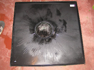
Here's another progress shot from this morning - I had used newspaper and masking tape to cover the mirror. Amazingly, it came off perfectly - not a drop of paint on the mirror!

And here's the finished product:

It's quite heavy, so it wasn't particularly easy to get a shot of it against a wall! I'll be sure to post another picture when I've decided where it's going and actually hang it.

Voila! A funky mirror for less than $50.

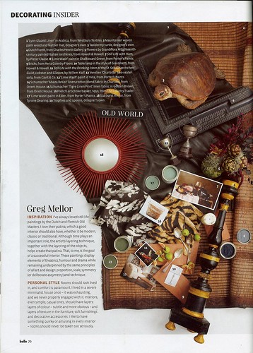
P.S - look what I found while flicking through the February / March 2010 edition of Belle magazine!

belle

Is it really wrong that I want to re-paint my mirror red?
Le House of Tarjay

I've made a few purchases lately from Le House of Tarjay (otherwise more commonly known as Target). They currently have a big home sale on, which has encouraged me to try and find some budget priced items which can achieve a designer look.

I dropped by during my lunch break today and picked up this "Round Iron Spike Mirror" for the grand total of $25 (on sale down from $59).

It's currently a brassy colour, which doesn't really suit my house. So I'm planning on painting it black. I'm not sure what is the best to use in these circumstances - spray paint seems like an easy option. In any event, I'll keep you updated if I have any success!

If anyone is looking for bedding items, they have some great bargains! I also purchased two europeans pillows for $22 (buy one pillow - get the second for $2) and their 1000 thread count sheet sets are currently half price.

Sunday, March 21, 2010

Changes and purchases

After a lot of number crunching, I decided to pay the little bit extra (over aluminium blinds) and install roller blinds. I'm delighted with my choice and glad I spent the extra.


I chose a white roller blind which has a nice texture through it and lets light filter through.


In other news I bit the bullet and bought this gorgeous antler hook. I just have to get around to hanging it, but I'm sure it will look wicked in my entry.

Cheap thrills

I had a bit of a splurge at Ikea yesterday picking up some of those final bits and piece, chopping boards, bowls, an "Andy" trolley but the biggest bargain was a selection of fabrics from the "Patricia" collection.
The whole range was on sale for half price at my local Ikea (down to $5/m), so I picked up 1m each of 4 different selections and made some throw cushions.

Here are the finished results, I think they look pretty great, even if I do say so myself.


I can't claim the credit for the gorgeous greeny/gold pillow at the front - it's from Aura.

This is Lola, my parents' new puppy enjoying the newly made cushions.

Total cost of fabric = $20
Cost of pillow inserts = $6
Help from my wonderful Mum in sewing the cushions = priceless.

Sideboards... yet again!

Yes I know, if I mention my love of sideboards again I'm going to lose any followers I have of this blog! Unfortunately, I felt that my previous sideboard was just too dark in comparison to the rest of the furniture in my living room!


Don't worry, I'm not planning on getting rid of it any time soon - I think I will relocate it to my bedroom or study. But success! after my long and drawn out search I now have a new sideboard. It's super cute, the perfect colour and the price is probably the best part - $50.


The previous owner explained to me that her mother-in-law had it custom designed back in the day and it was once the pride and joy of her house. I think it's nice that it now has a wonderful new owner (i.e. me) who will love it once again.

Sunday, March 14, 2010

Frame my life

I (still) haven't moved into my house... it's a bit of a joke among my friends and family, but once I organsie a trailer / van / ute / helpful friend with a big car, I can finally manage to get the last few items of furniture into my house.

In the interim, I've been obsessing about my walls! They are totally bare at the moment and I'm a bit stumped for ideas.

I love the idea of a collection of frames with photos and/or art. Here's a little bit of inspiration I've found:

Image from creaturecomforts.

I love the image above - the consistent use of black frames really ties the space together. However, I think the overall style (while beautiful) doesn't suit my house.

Image from Candimandi.
I adore this person's style - it's so cute and quirky.

Image from Candimandi.

It was purely coincidental that I found two images that were both from CandiMandi. But CandiMandi, whoever you are - you rock my world.
I've mentioned previously how I'm a big fan of having frames propped up against a wall as opposed to hung. It works so well on a sideboard and makes if easy if you're inclined to move your art around.


Image from leVintageMaison.

Isn't this just darling? The birds and the butterflies are so whimsical!

Image from no penny for them.

I just think this set up is pretty.

OK, so I think I can probably handle purchasing some frames. But the next question is - where does one source their art from? I'm on a budget and have no artistic talents whatsoever, so DIY is totally out of the question.... I think etsy might be the way to go! The hunt is on!

Tuesday, March 9, 2010

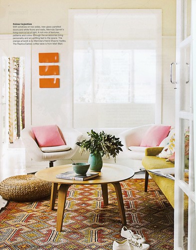
Magazine Inspiration - Part 3

Here are some photos of yet another house (or at least a room) which I love.

SCAN0023

I have to admit I'm a bit jealous of whoever owns this house - they have the most amazing eye. For example, I think if I saw that rug on it's own it would get the thumbs down from me.

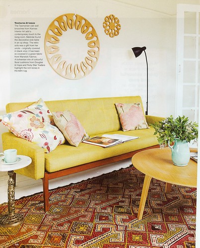
SCAN0024

Similarly, those pillows could scream "granny" if taken out of context. But together - the gorgeous mustard yellow sofa, the Eames style coffee table it's just perfect. I love the colour palette and the eclectic feel of the room.

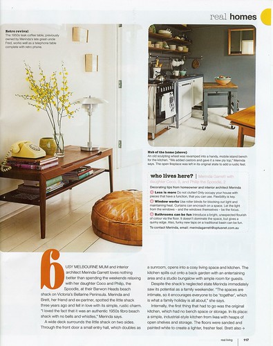
SCAN0025

Isn't the telephone table (complete with retro phone) just the perfect touch?

All images from RealLiving Magazine.

FYI - if you're after that gorgeous coffee table, you can purchase similar from Matt Blatt or Click-On Furniture.


Monday, March 8, 2010

Getting there...

Slowly but surely my place is turning from what was just a house, or a reno job, to a home. I spent a couple of hours there tonight sorting out my homewares and dropping some more furniture off. I thought I'd post a few photos of my latest progress and purchases.

Here is yet another attempt of my to sort out my plates etc to find an appropriate spot in my kitchen:

I wish I could say that's all I have, but unfortunately I would be lying!

This door mat is one of my latest purchases - I think it's almost too pretty for people to wipe their feet on. Looking at this picture, I think I need to turn it the other way.

I finally managed to bring my sideboard over to my property. The photo was taken at night, which is why it's so dark.

I've finally taken the plastic cover off my couch... and did you notice - my cowhide rug arrived!


Despite my flip-flopping, I'm really happy with my chair and table choices.

Undomestic goddess

Well it's official - I've started making the big move into my house! If I'm being completely honest with myself, I know this process will take at least a couple of weeks - but it's exciting none-the-less.

I've started moving all of my homewares which is a scary process. I'm not quite sure how I'm going to fit everything into my little kitchen. At the same time my inner Martha Steward has come out to play and is haunting me. I want my cupboards to be pristine, organised and well thought out... just what the perfect 1950's housewife would have.


Unfortunately, as I've never lived in the property with it's new kitchen etc, I'm not sure how everything will work. I have a million questions running through my head like: Is it better to have my food stored in a high cupboard, or low down? Am I going to be annoyed if my pots and pans aren't in close proximity to my stove?

At the end of the day, it won't surprise me if it's a matter of trial and error until I find something which works. But it would be nice to have success on my first try!

Wednesday, March 3, 2010

Display ideas

I've previously mentioned a few of the display items in my home, in particular my retro sideboard and my genie bottle.

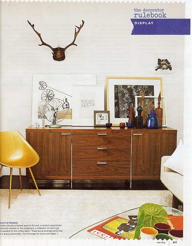
While flicking through a recent copy of RealLiving Magazine I came across this image:

SCAN0021

I really love this display and would like to think I can incorporate something similar in my house. The balance between the antlers up high and the group of bottles just works! Plus I love the casual element of propping pictures against the wall, as opposed to hanging them.

I already have the sideboard and one genie bottle - I'm wondering if I should aim to collect some more. Alternatively, I've started collecting a few pieces of amber glassware which could work in this type of set up... I guess time will tell.

All quiet on the western front

It's funny how inspiration comes in peaks and troughs. I've been pretty quiet on here of late and in all honesty, I blame it on painting my stupid house!

I take it back, my house is by no means stupid - but I'm at a point where I just want it finished (and to look like it jumps out of the pages of a Vogue living magazine). I know - completely unrealistic expectations for a 20-something's first home, but a girl can dream.

I'm not meaning to advertise here, but being the lover of designer furniture (and the replica versions which I can afford) that I am - I just fell in love with this image advertising Click-On furniture's sale.


The tulip table...

The DCM chairs...

The shaggy rug... the full length curtains... the collection of vases... it's just perfection! And it's making me re-think my table and chair choices!