Apologies again for being a terrible blogger, between quitting my job and starting somewhere new, my life has been a bit hectic to say the least! It also means that all my inspiration to have my garden looking gorgeous has all but gone out the window!
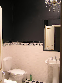
In the mean time I've been helping my parents around their place and living vicariously through their zhoosh-ing of their home. The most recent task was updating their bathroom... now for the record this bathroom was renovated at least 15 years ago, so it definitely needs to be completely redone. However, for the interim, the decision was made to paint it black and add a chandelier which Mum has lying around the house (as you do...). Let me know what you think of the results.
In the mean time I've been helping my parents around their place and living vicariously through their zhoosh-ing of their home. The most recent task was updating their bathroom... now for the record this bathroom was renovated at least 15 years ago, so it definitely needs to be completely redone. However, for the interim, the decision was made to paint it black and add a chandelier which Mum has lying around the house (as you do...). Let me know what you think of the results.
PS - damn bathrooms are hard to photograph, especially when they are this tiny!
The Befores:
As you can see the bathroom is relatively plain and in a somewhat traditional style - black and white floor tiles laid diagonally, white wall tiles with black feature tiles. The mirror needs to be replaced and the pedestal sink is a little outdated.


During:
Picking a paint colour (and making sure we were happy with such a bold choice!). We ended up using "black orbit" which is a British paint colour if I recall correctly. When it's wet it looks navy, but it dries darker. It's not a pure black, but is pretty close.

Ta da! OK we aren't 100% finished, as you can probably see the door and door frame needs to be painted and there are some finishing touches to be added. Mum is thinking of putting some black and white prints on the wall and possibly putting a black frame around the mirror. I'll keep you posted.


Overall we are really happy with how it's turned out. It makes for a pretty dramatic statement to say the least! When we were picking out the paint the chick at Bunnings half-scared me by suggesting that it would be too dark. But by keeping the ceiling white and having the white wall tiles - it's enough to balance out the black and make for one interesting bathroom.


Oh, to have a chandelier sitting around the place :-) Love it! It looks so much better.
ReplyDeleteLove the result!
ReplyDeleteSo striking!